E.T.
Movie Poster Design
DESIGNX434-028 | Portfolio | UC Berkeley Extension
Background
The movie “E.T.” came out in 1982 and quickly became a classic. It is a story about a little boy that meets and alien. During the heartwarming film the two become friends while the little boy helps E.T. to find his way back home. The movie was based on an imaginary friend the film’s producer & director, Steven Spielberg, created after his parents divorced. He eventually collaborated with Melissa Mathiason to write the script. It was a hit as soon as it hit the box office and the main character, E.T., became a pop culture icon around the world. The movie itself has been deemed “culturally, historically or aesthetically significant” by the Library of Congress who added it to the National Film Registry in 1994.
Design Problem
If you have never seen the movie before you wouldn’t know who the main character was by looking at the movie poster. It is a picture of the iconic scene where E.T. and Elliot are on the bike flying in front of the moon, so it’s not easy to see who they are and what makes E.T. so special.
Design Process
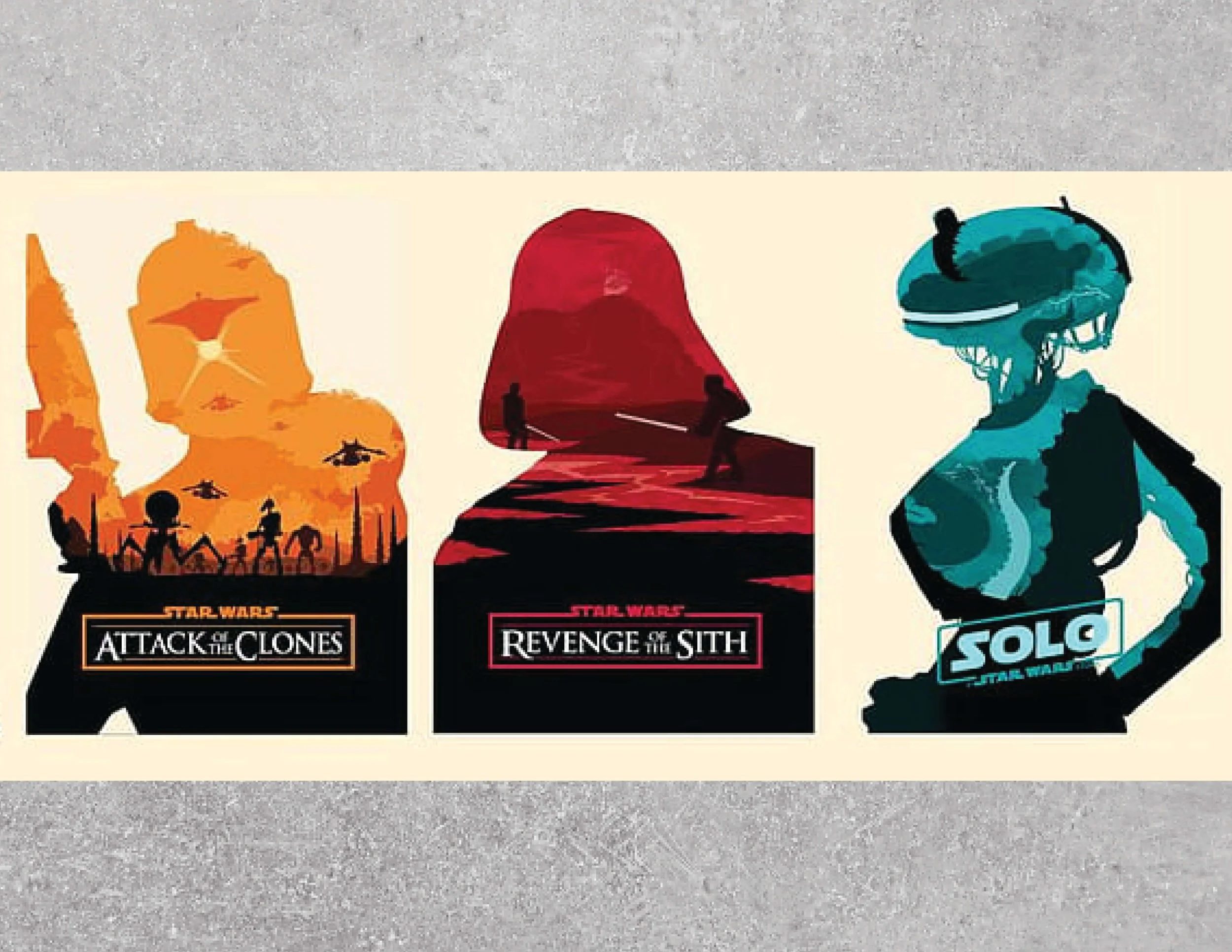
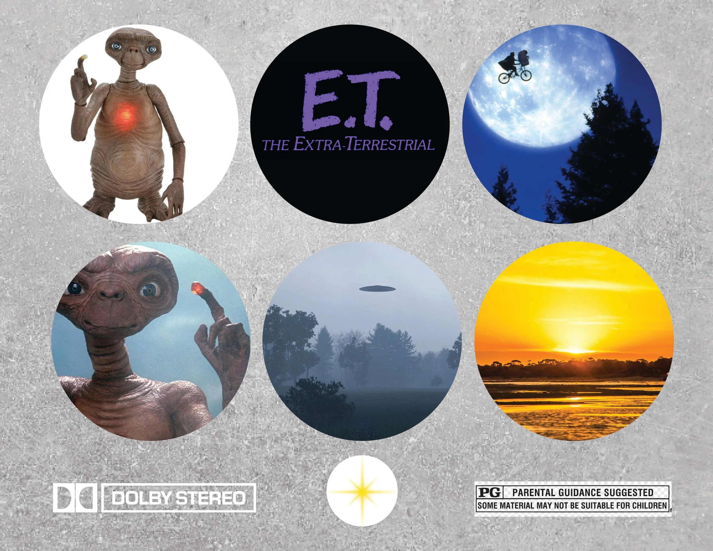
I initially did some research on movie posters and what the original E.T. poster looked like. I found the image below from the Star War series and decided I was going to create something similar to highlight the main character, E.T. The original E.T. movie poster had the iconic “E.T. & Elliot flying bicycle in front of moon” scene as the key image. Other posters I found utilized E.T.’s glowing finger touching Elliot’s finger, so I wanted to make sure those two images were included in my redesign. I then looked for a full body image of E.T. that I could use as the clipping mask for the moon image. I also found some trees and a sunset to finish the feel of the composition. I used Google Images with the File Size set to “Large” to find the proper size for all these images and started uploading them into Photoshop. I first cropped out the background of the E.T.
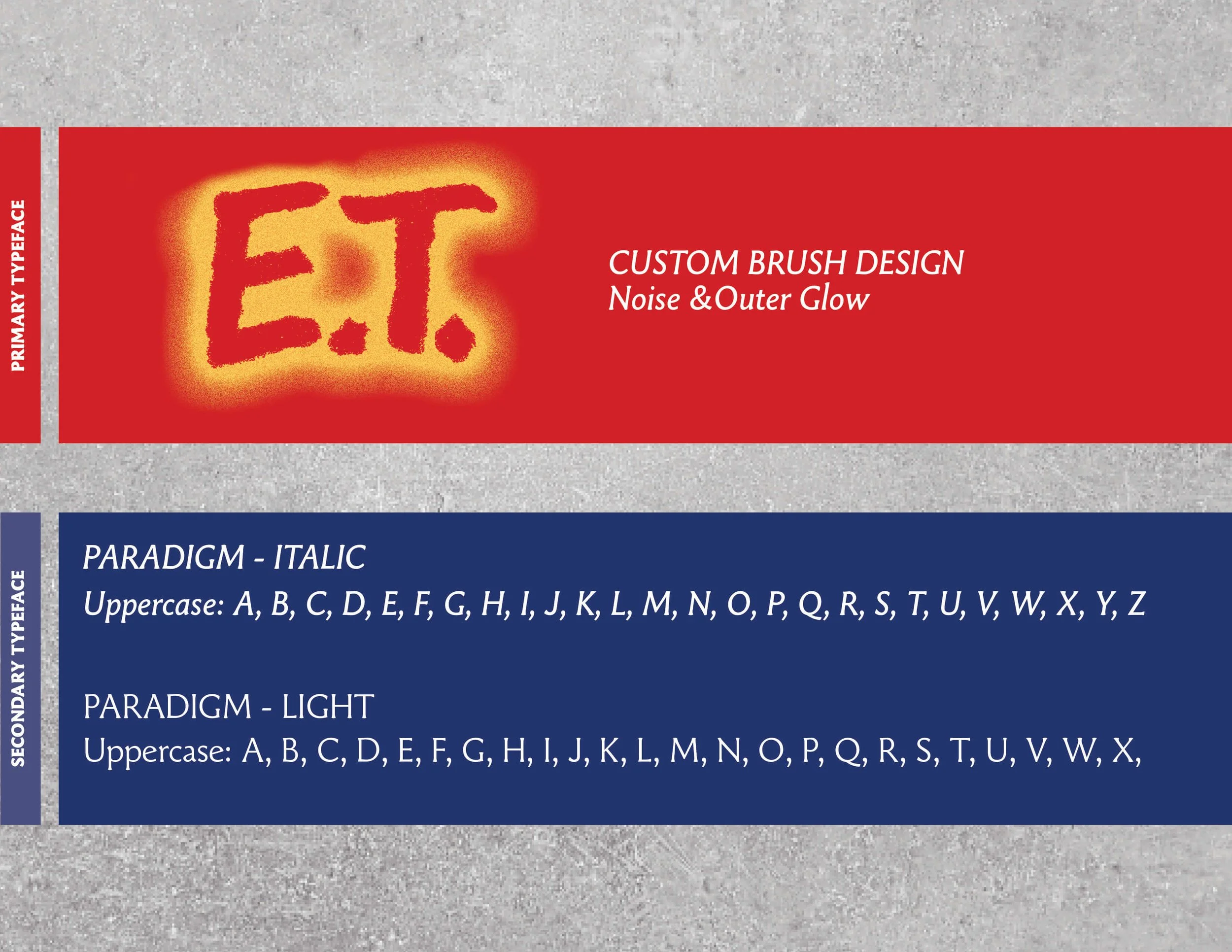
I then used that image as a clipping mask for the moon scene. I decided I wanted more texture to that portion, so I found a “moon surface” texture to overly at 57% opacity on top of the E.T/moon photo. I also created a star/sparkle in Illustrator to use on E.T.’s finger and in the sky (E.T.’s head) for the stars. I coupled that with a red and yellow oval over his fingertip to mimic his finger glowing. I used the brush tool and adjusted the settings to create a similar “E.T.” that matched the original title logo. I also matched the color of the “E.T.” with the fingertip to make the title stand out. I put the silhouette of the trees on the left and the right of the E.T. along with a sunset behind all of it to finish off the composition. I ended up going with Paradigm for the typography since it was very similar to what was used on the original poster.

Design Evolution
The final design encapsulates the iconic moon image with Elliot & E.T. within the shape of E.T.’s body reinforcing the importance of E.T. as the main character of the movie. Overlaying the moon texture on to this portion of the poster not only made it feel more like the real moon, but also brought a vintage feel to the poster.

E.T. Movie Poster - Original (1982)

E.T. Movie Poster - Reimagined (2024)
Design Solution
The final movie poster composition is a modern take on the original poster breathing even more life into the main character. For the expansions I utilized images from various important scenes from the movie combined with the iconic moon scene in the background to create a design system that allows for variation while still keeping true to the core elements of the film’s franchise.
-
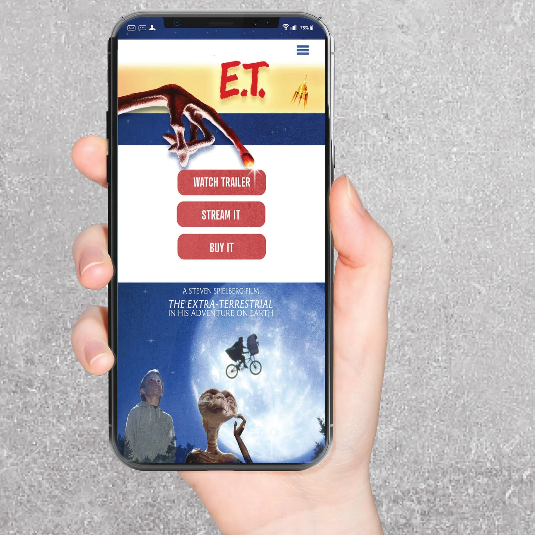
![Mobile Website Homepage]()
Mobile - Website Homepage
-
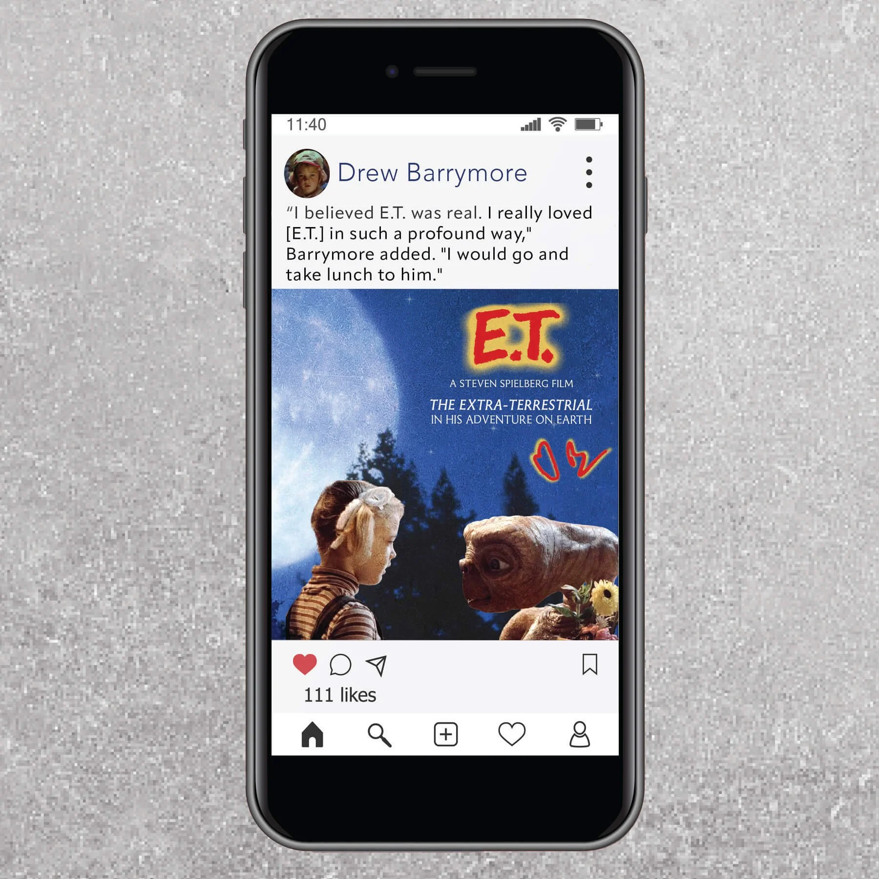
![Mobile - Social Media Post]()
Mobile - Social Media Post
-
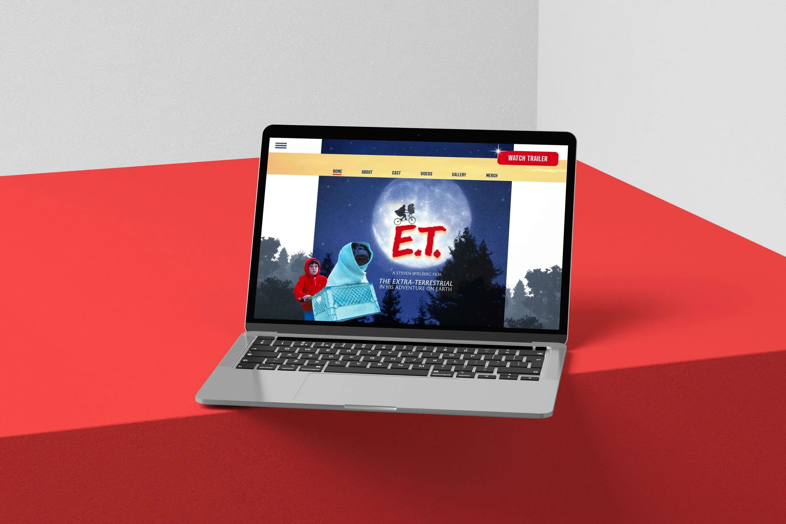
![Laptop - Website Homepage]()
Website - Homepage
-
![Movie Advertisement - 50th Anniversary]()
Movie Advertisement - 50th Anniversary
-
![E.T. Movie Tickets]()
Movie Tickets
-
![Record - 50th Anniversary]()
Record - 50th Anniversary
-
![E.T. Movie Poster - Reimagined]()
E.T. Movie Poster - Reimagined