BLOCKX + Frida Kahlo
Artist Collaboration Ad Campaign
DESIGNX434-028 | Portfolio | UC Berkeley Extension
Background
In the Photoshop class we were asked to create an ad campaign combining real artist paintings photoshopped to adverstise a particular brand. I chose Frida Kahlo’s works and paired them with the BLOCKX oil paint brand.
Design Problem
The challenge was to showcase the quality of the paints while tying it to a well-respected artist. The design needed to keep the paint as the focus and bring to life the possibilities for application.
Design Process
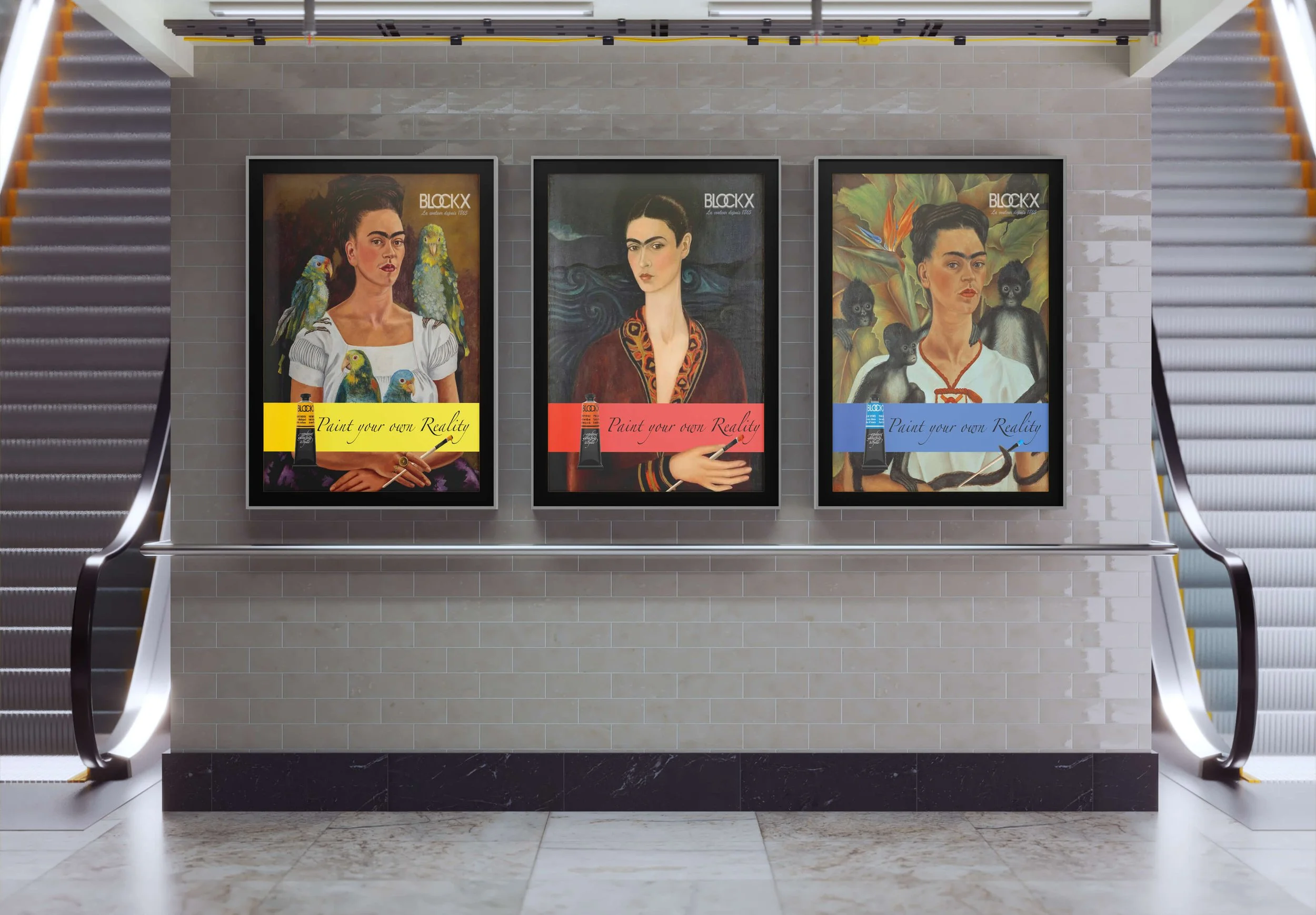
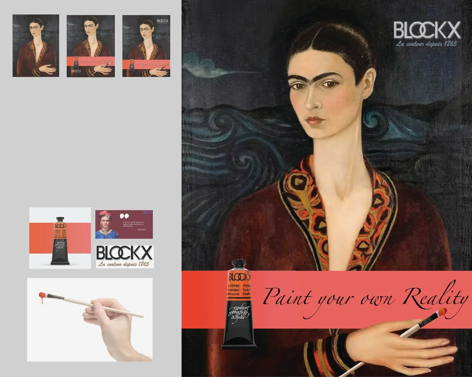
I looked for a paint product from the art industry and found a high-quality oil paint brand that had vibrant colors to choose from. I had a vision of coupling it with one of my favorite artists, Frida Kahlo. I researched her works and narrowed in on a few paintings of hers with her hand in them. I envisioned superimposing a paint brush into her hand so it would look like she was painting the tagline onto the banner. I looked at stock photos to find the paintbrush. I utilized an image I found from BLOCKX for each of the paint tubes with the colored banner. In each ad I extended the banner that was behind the product so it would span the full width of the poster.
I color matched the lighter shade in Illustrator to keep it consistent. This is the focal point for each ad. From there I superimposed the paint brush into the hand of Frida in two of the posters and the monkey tail in the other using a layering mask, hue saturation, and curves in Photoshop. I was able to create a connection between the paint and the tagline in Photoshop giving the impression Frida is actually painting the tagline onto the banner. This brings movement to the ad and the verbiage is a call to action for the customer.


Design Evolution
I took the feedback from my Photoshop class and iterated on it for this class. The first major change was to omit the poster that had two Fridas (far left). It didn’t flow with the other since they were self portraits. I replaced it with another self portrait of Frida with monkey’s surrounding her. The posters looked more uniform, but there were a few issues that still needed to be resolve before I could finalize the ad campaign.
I had to photoshop the hand on the middle painting so I could lower the banner to have them all align. The other major issue was the Frida with the monkey’s didn’t have a hand to hold the brush, so I photoshopped a monky tail to hold it. The last revision was to move the BLOCKX logo to the upper right for more visibility.

BLOCKX + Frida Kahlo Ad Campaign - Version 1 (w/ two Frida Poster)

BLOCKX + Frida Kahlo Ad Campaign - Version 2 (sub two Frida Poster w/ monkeys)

BLOCKX + Frida Kahlo Ad Campaign - FINAL (edited monkey tail to align brush and banners)
Design Solution
The final ad campaign is eye catching and cohesive. The design easily adapted for in store and magazine ads. By utilizing the same color palette and I was able to create packaging and shopping bags that flow with the design as well.
-
![]()
Subway Ad Campaign
-
![]()
Bleu di Sevres Shopping Bag
-
![]()
Indian Yellow Magazine Ad Mockup
-
![]()
Pyrrolo Vermillion In Store Ad Mockup
-
![Merchandise Packaging - All Colors]()
Merchandise Packaging - All Colors