URBAN Gardening
Magazine Design
DESIGNX434-028 | Portfolio | UC Berkeley Extension
Background
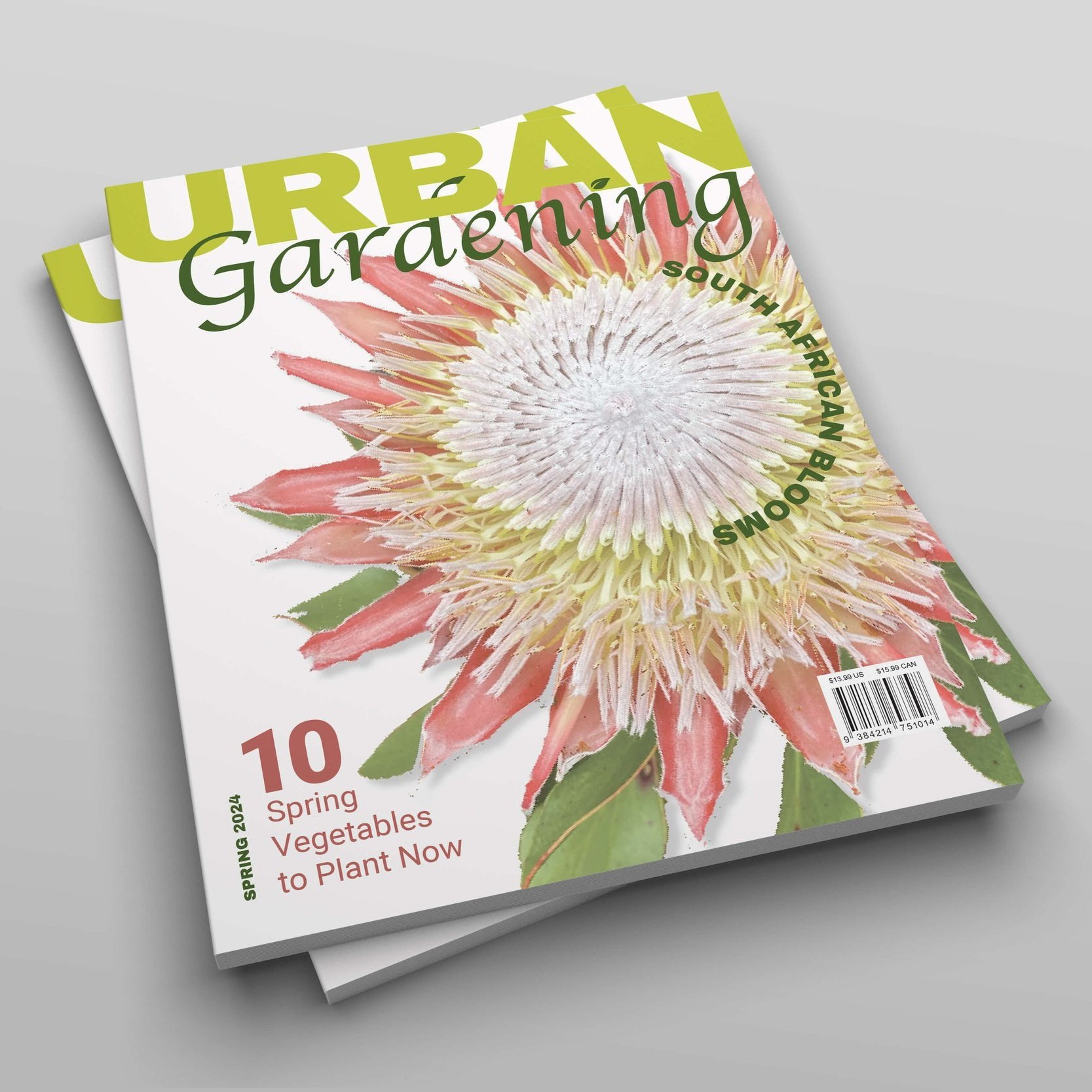
URBAN Gardening is a fictitious magazine I created in my Photoshop class. I love gardening and taking photos of my flowers. The flower on the cover of this photo is a King Protea that I have in my backyard. I am proud of the variety of plants that thrive in my San Francisco garden, so I thought it would be interesting to have a magazine that could be an inspiration for urban dwellers that have a green thumb or are curious about what can be successful in San Francisco or any other urban community.
Design Problem
The design aesthetic for a gardening magazine is traditionally geared towards older generations. The feel is usually more formal. I wanted to interject a modern youthful approach to the masthead and settled on a logo that would encompass a little of both.
Design Process
Once I decided what direction I was going with the vibe of the magazine I tested out various serif and sans serif combinations in Illustrator. The typefaces I chose are in contrast, but each flow well with the portion of the logo they are set in (“Urban” is set in Archivo Black, a sans serif, modern font, while “Gardening” is set in Apple Chancery, a more traditional serif font).
I used the color picker in Illustrator to select the color palette for each issue. For the original masthead I wanted to keep the same color family but have “Gardening” darker to have it stand out a bit more since the font isn’t as bold as the one used for “URBAN”.
I opted to have “URBAN” span the entire width of the masthead and the “Gardening” portion just below and aligned to the right. I then edited the image of the king protea in Photoshop, removing the background and softening the edges. I scaled it up to be nearly the whole cover so you could see the detail in the bud of the flower. I used a texture underneath a complementary pale pink with low opacity. I tested various levels of opacity for the flower as well so you could see the article.
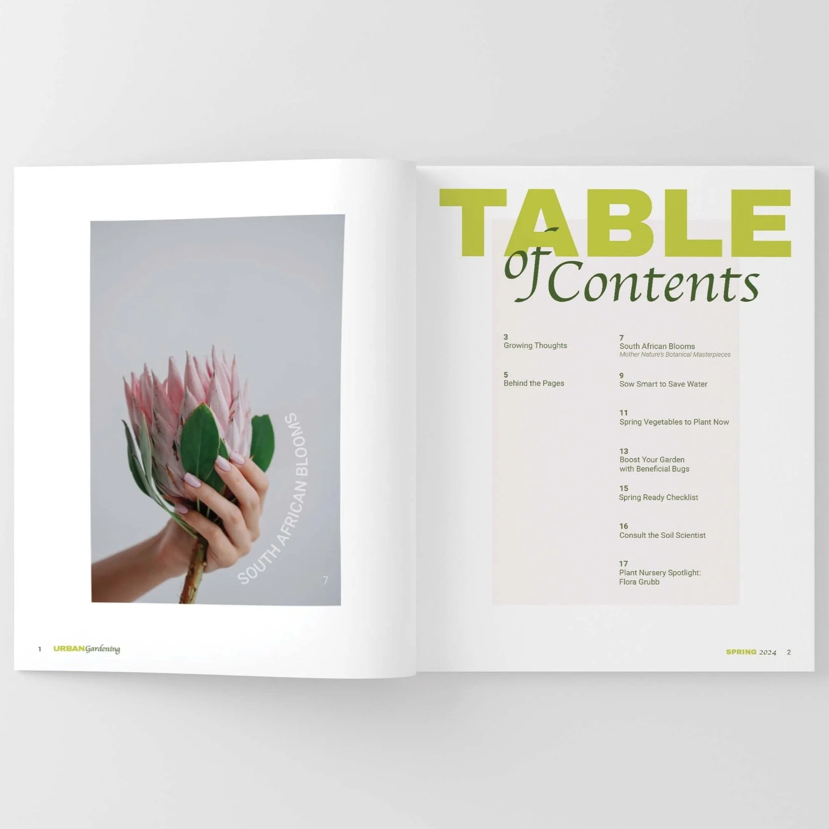
I used a layout grid consisting of 6 columns and 12 rows. This allowed for flexibility in the design while also keeping the same feel as you flip through the magazine.


Design Evolution
I created the initial URBAN Gardening logo in my Photoshop class. It was a good start, so I continued refining if for my Portfolio class . I started with the masthead by extending the stem of the “d” through the “B” to give it more dimension. I also replaced the tittle on the “i” in gardening with an image of a leaf to further build the connection with plants and nature. I took that leaf and combined it with the “U” from URBAN to create the brand icon.
The design system for each issue is the same. For each cover I extracted colors from the featured flower to update the masthead which changes the feel of each issue while still keeping them uniform. The main article title is place on the flower. For 2024 it is curved. That placement can change from year to year. The secondary article is placed on the bottom left corner. The season and year are vertical to the left of the secondary article title and the UPC barcode is on the bottom right corner.

URBAN Gardening - Original Logo
URBAN Gardening - Refined Logo
URBAN Gardening - Horizontal Logo

URBAN Gardening - Icon Logo

URBAN Gardening - Cover - Spring 2024

URBAN Gardening - Cover - Summer 2024

URBAN Gardening - Cover - Fall 2024

URBAN Gardening - Cover - Winter 2024
Design Solution
The final design is a modern take on an age-old hobby magazine. It has a clean modern look, with a hint of tradition. The masthead and article titles take colors from the flower itself, so the overall look feels cohesive.
-
![URBAN Gardening - Spring 2024 Cover - Stack of Mags Mockup]()
Spring 2024 Cover - Stack of Mags Mockup
-
![URBAN Gardening - Table of Contents Mockup]()
Table of Contents Mockup
-
![URBAN Gardening - Editor's Letter Mockup]()
Editor's Letter Mockup
-
![URBAN Gardening - Contributor's Page Mockup]()
Contributor's Page Mockup
-
![URBAN Gardening - Main Spread - South African Blooms Article]()
Main Spread - South African Blooms Article
-
![URBAN Gardening - Inner Pages - 10 Spring Vegetables to Plant Now]()
Inner Pages - 10 Spring Vegetables to Plant Now
-
![URBAN Gardening - - 2024 - Spring & Summer Covers]()
URBAN Gardening - 2024 - Spring & Summer Covers
-
![URBAN Gardening - 2024 - Fall & Winter Covers]()
URBAN Gardening - 2024 - Fall & Winter Covers
-
![URBAN Gardening - Summer 2024 - Front, Spine & Back Covers]()
URBAN Gardening - Summer 2024 - Front, Spine & Back Covers
-
![URBAN Gardening - 2024, 2025, 2026, 2027 - Spine Design System]()
URBAN Gardening - 2024, 2025, 2026, 2027 - Spine Design System