Juntxs Podemos
Website Design
DESIGNX434-028 | Portfolio | UC Berkeley Extension
Background
Dolores Huerta Elementary, a Spanish immersion elementary school, has had a fundraising campaign for decades called “Be A Hero”. The campaign’s goal was solely for soliciting monetary donations for the school. The PTA wanted to revamp the messaging for their annual campaign to be more inclusive of the community members that can’t donate monetarily but donate their time and energy to helping around the campus. Two of the school’s core values are equity and inclusion, so it was important to rename the campaign something that brought the community together while also raising money and energy to realize the goals of ELAC, the PTA and staff. After many meetings with all parties involved, I helped to create a logo that encompasses the school’s message of supporting the school in unity. There were also conversations around the Spanish spelling. Some of the community wanted the more progressive version “Juntxs” and others felt that it should be “Juntes”, the traditional masculine form. The committee decided it was a larger conversation for the community to have a later date, so I came up with the solution of using the school’s falcon logo as the place marker for the “e” or “x”. The campaign did incredibly well the first year it was implemented, so the school would like to continue expanding the marketing around it.
Design Problem
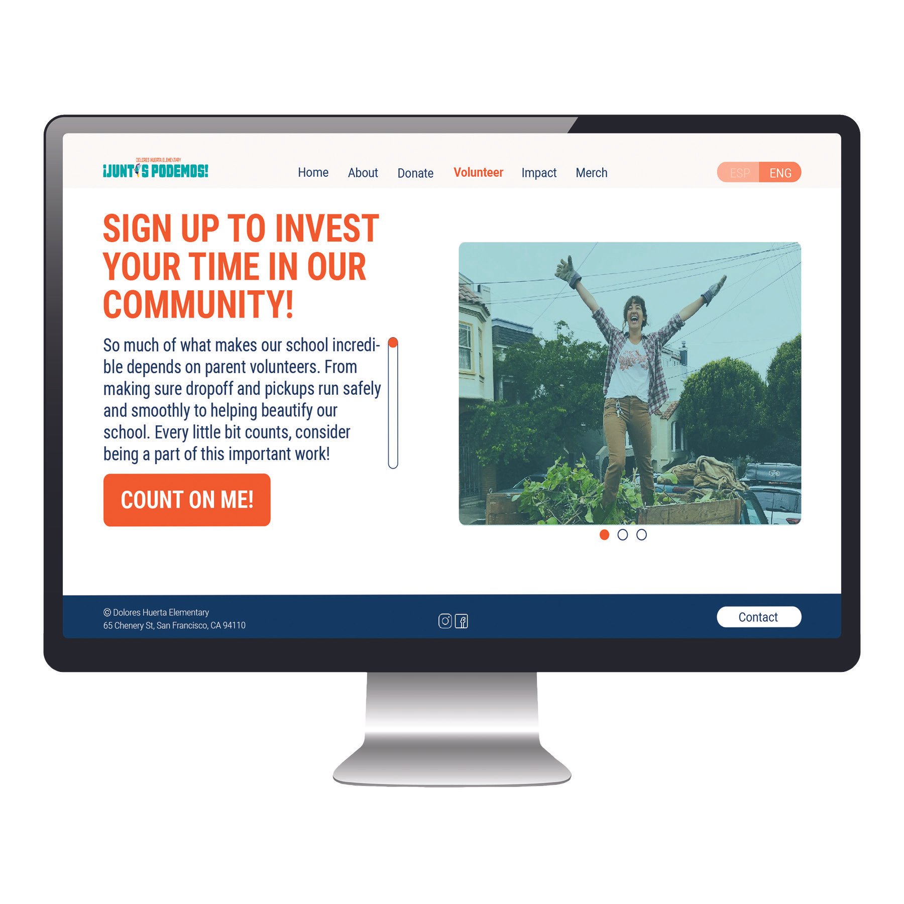
The current website does not follow the brand identity and needs some revamping to be more engaging. The colors used for the buttons and hyperlinks are completely different from the logo. The blue color used for the hyperlinks is also hard to read. There is no Call to Action on the landing page and there is too much verbiage. Readers will likely lose interest quickly. The buttons aren’t a consistent shape and there is no button for volunteering.
Design Process
The first step in my process was to do a little research on what makes a good fundraising web page. I took some notes as I read through each site and started to make some quick sketches of layouts. I saved a few of the example pages into a mood board on Pinterest as well. With those ideas in mind I looked at the website the school currently has and analyzed what was working and what wasn’t. I also referred to the brand identity guide the school was given when the new falcon logo was created. I created a CC Library with the logo colors, so I would have a palette to work with while designing the updated website. I utilized these while creating the mockups in Illustrator.
I looked through the school’s community app, Bloomz, to find pictures of the community to include on the Landing, Volunteer, and Impact pages. The ones I used on the landing page I uploaded into Photoshop to remove the background. I chose to use a 12 column grid so I would have alot of flexibility with the images and text i wanted to incorporate into the new design. I chose Roboto as the main typeface for the website. I wanted something that we easy to read and simple given the graphic nature of the logo.


Design Evolution
I took the information from the original webpage and broke it into easier to read pages that engage the user and ask for their participation. I used a grid so that each page has a similar feel. I kept the font sizes and buttons uniform from page to page creating a website that feels engaging and uniform.

Juntxs Podemos - Landing Page - Original

Juntxs Podemos - Landing Page - Reimagined
Design Solution
The final design is playful and to the point asking the user: “How will you support our community, will you DONATE or VOLUNTEER?”. The CTAs on each page are engaging and the explanations are clear. The overall messaging speaks to “our community”. The color choices are uniform on each page and based on the brand identity for the school and fundraiser. The use of real pictures from the community brings an element of connection to the viewer.
-
![Tablet - Landing Page]()
Tablet - Landing Page
-
![Mobile - Landing Page]()
Mobile - Landing Page
-
![Juntxs Podemos Website - Landing Page]()
Juntxs Podemos Website - Landing Page
-
![Juntxs Podemos Website - About Page]()
Juntxs Podemos Website - About Page
-
![Juntxs Podemos Website - Donate Page]()
Juntxs Podemos Website - Donate Page
-
![Juntxs Podemos Website - Volunteer Page]()
Juntxs Podemos Website - Volunteer Page
-
![Juntxs Podemos Website - Impacty Page]()
Juntxs Podemos Website - Impact Page
-
![Juntxs Podemos Website - Merchandise Page]()
Juntxs Podemos Website - Merchandise Page
-
![Juntxs Podemos Website - Merchandise Pop Up Page]()
Juntxs Podemos Website - Merchandise Pop Up Page