Mission Science Workshop
Branding
DESIGNX434-028 | Portfolio | UC Berkeley Extension
Background
Mission Science Workshop was founded in the garage of Dan Sudran who had many collections that drew curious kids in when he was tinkering. That inspired him to create a “science workshop” where kids from all across San Francisco could go to tinker, build and explore. For over 30 years they have been educating kids from 65 schools, mostly in high-need communities and all in a bilingual format. The students can crack open fossils, solve bone puzzles, wire a toy, build a wooden scooter, or interact with live animals.
Design Problem
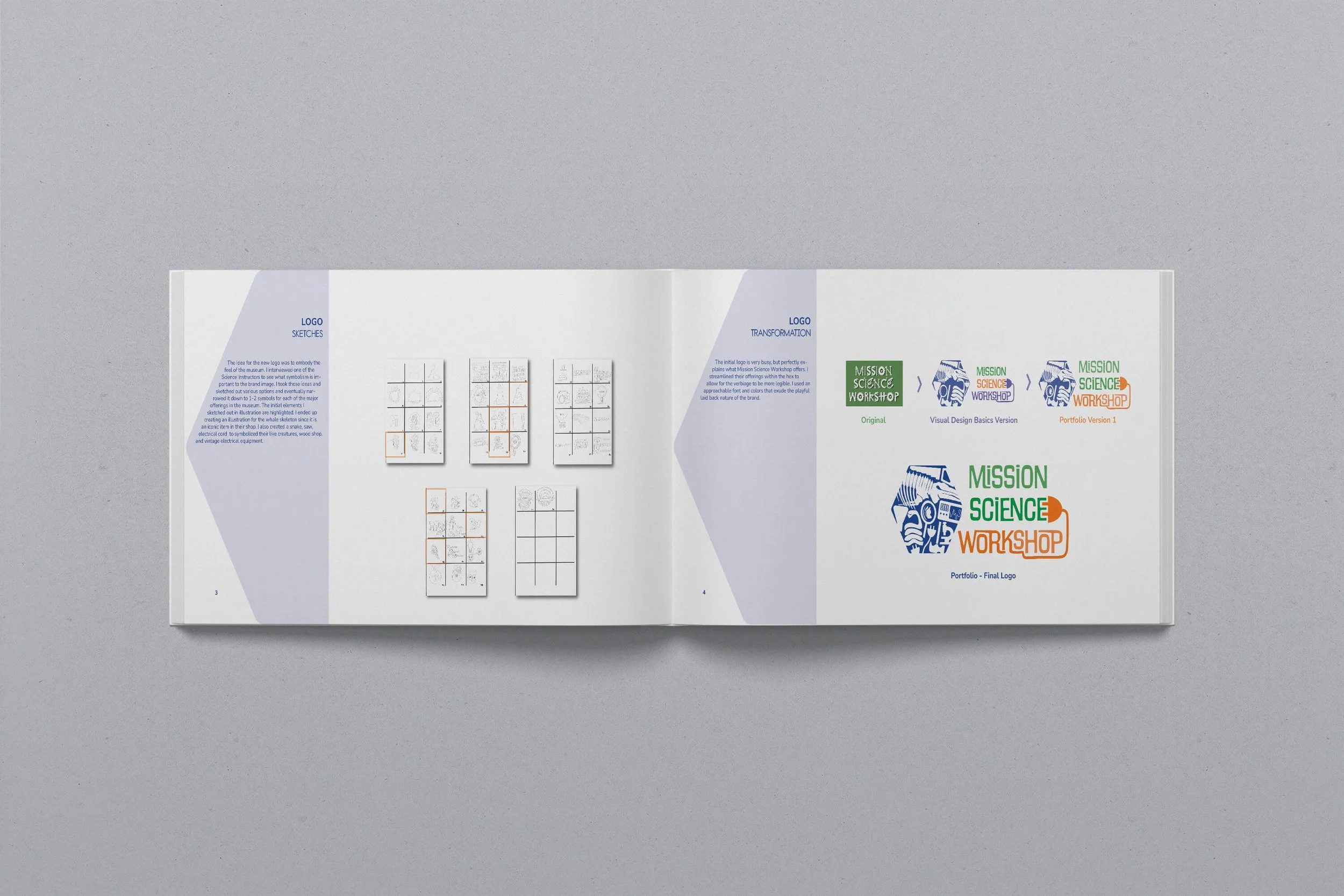
The original logo for Mission Science Workshop was very busy. Although it did visually depict many of the key offerings of the museum offered it was hard to read. After interviewing the museum’s lead instructor I realized the importance of incorporating as many of the amazing things they offered into the logo was important to them. Their shop from inception was always a mishmash of things and that was what had made them successful.
Design Process
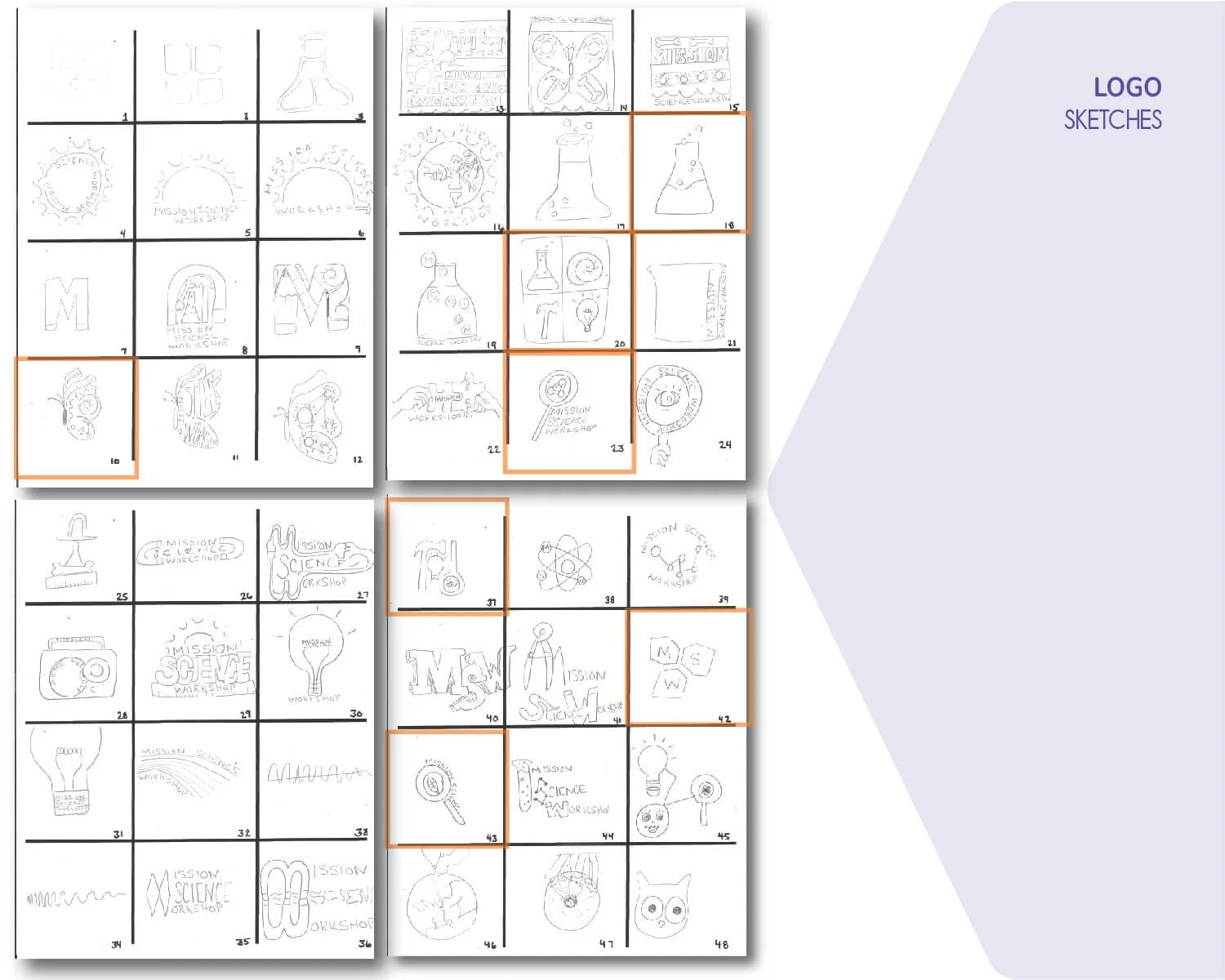
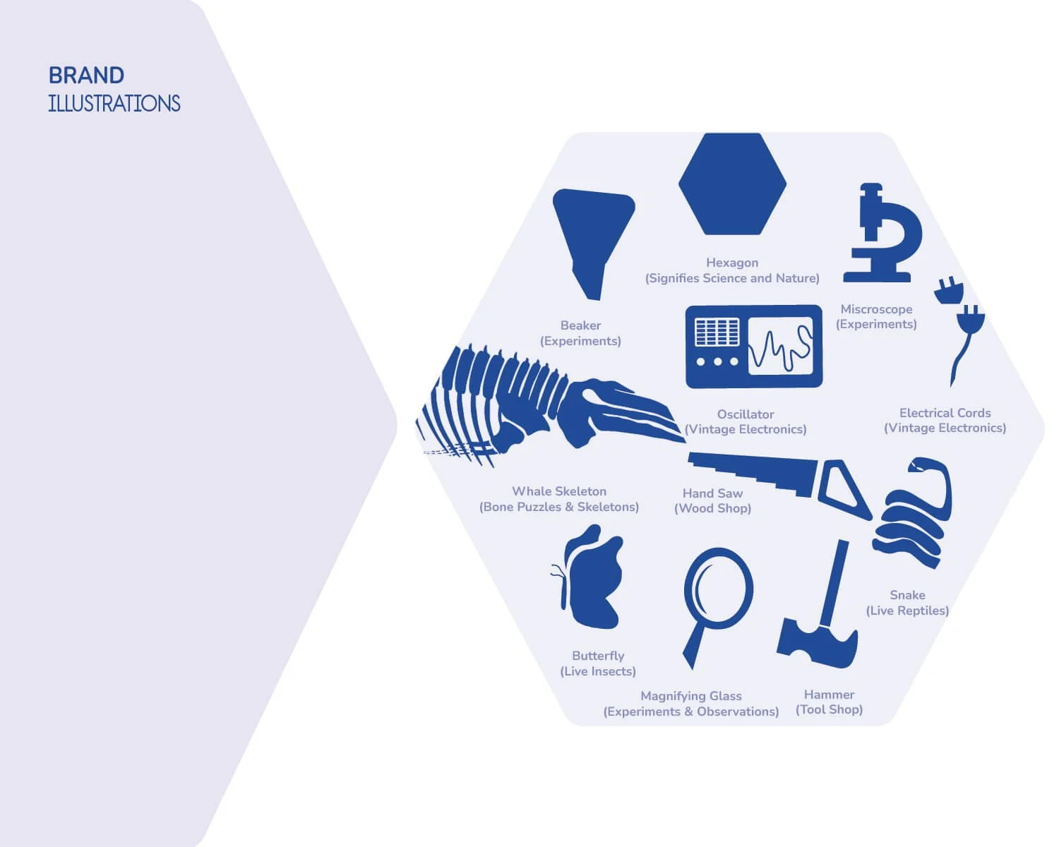
The idea for the new logo was to embody the feel of the museum. I interviewed one of the Science Instructors to see what symbolism is important to the brand image. I took those ideas and sketched out various options and eventually narrowed it down to 1-2 symbols for each of the major offerings in the museum. The initial elements I sketched out in illustration are highlighted. I ended up creating an illustration for the whale skeleton since it is an iconic item in their shop. I also created a snake, beaker, microscope, oscillator, butterfly, magnifying glass, saw, electrical cord to symbolized their live creatures, wood shop, and vintage electrical equipment. I came up with the hex design to encapsulate the symbols of the key offerings.
The colors chosen reflect the feel of the museum. Given it is an interactive museum for elementary age kids the colors had to be approachable and fun.
The blue signifies inspiration, orange is playful and youthful, green oozes science and nature, and the purple is for imagination. The blue, orange and green are used within the logo. The purple is an accent color for use in other branding opportunities.
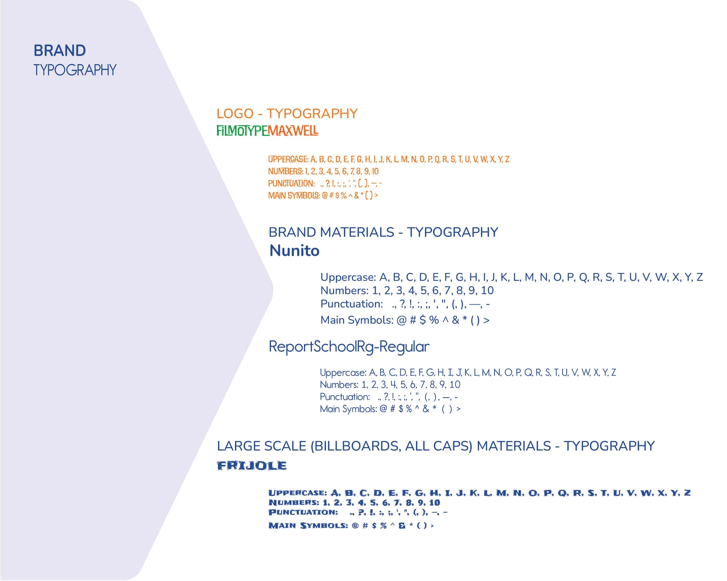
The typeface for the logotype was very important given the original was so bold and playful. I wanted to keep those same qualities, but make it easier to read. Filmotypemaxwell has a movement to it since some of the characters connect. It made it easy to create add a graphic to it to bring the logotype to life. The electrical cord seems to be growing out of the “K”. Nunito and ReportSchoolRg-Regular are the secondary typefaces for the stationary. The museum and staff are very laid back, so the typeface needed to have a sense of ease for their personality to flow through in their communications.

Design Evolution
The initial logo is very busy, but perfectly explains what Mission Science Workshop offers. I went through many iterations of the logo and finally ended up with the a design that streamlined their key offerings within the hex and allowed for the verbiage to be more legible. I used an approachable font and colors that exude the playful laid back nature of the brand. The verbiage has a sense of movement and playfulness. The “plug in” of the cord into the “E” allows for the logotype to be “connected” to the logo icon.
Mission Science Workshop Logo - Original
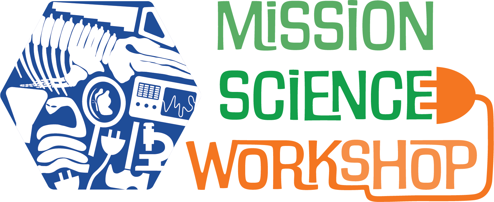
Mission Science Workshop Logo - Reimagined (2024)
Design Solution
The final design is playful and eye catching. It works well on Stationary, web and on merchandise. I has the ability to stand out as one color or as the tricolor original version.
-
![]()
Mission Science Workshop Branding Book
-
![Evolution]()
MSW Branding Book - Sketches & Logo Evolution
-
![]()
MSW Branding Book - Final Logo & Brand Colors
-
![]()
MSW Branding Book - Logo Illustrations & Typography
-
![]()
Stationary Mockup
-
![]()
Business Card Mockup
-
![]()
Website & Mobile Homepages
-
![]()
Lab Apron
-
![]()
Beanie Mockup
-
![]()
T-Shirt Mockup
-
![]()
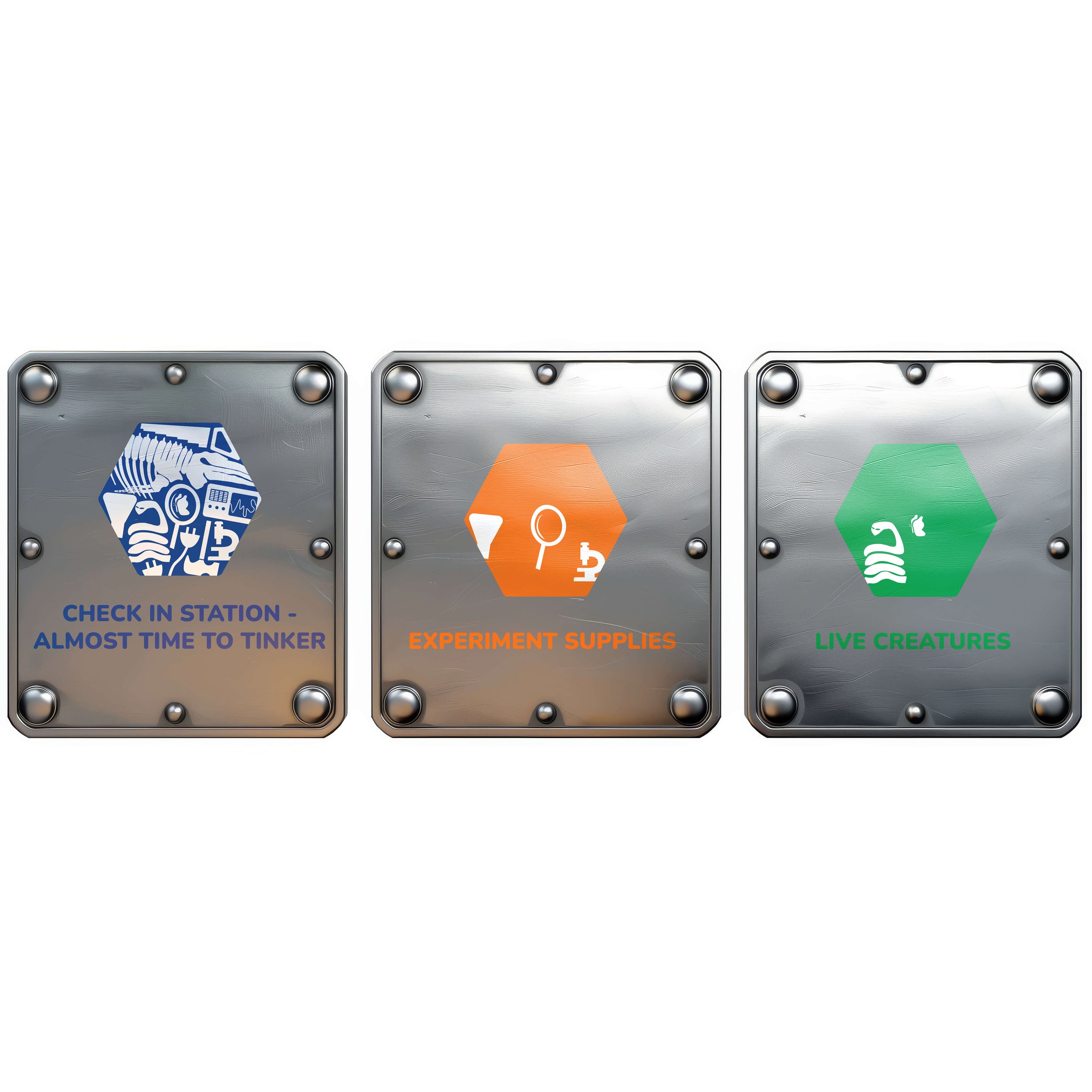
Shop Signs - Check In, Experiment, & Live Creature Stations
-
![]()
Shop Signs - Bone Puzzles, Workshop Tools, Vintage Electronics Stations
-
![]()
Advertising Posters
-
![]()
Billboard Advertisement