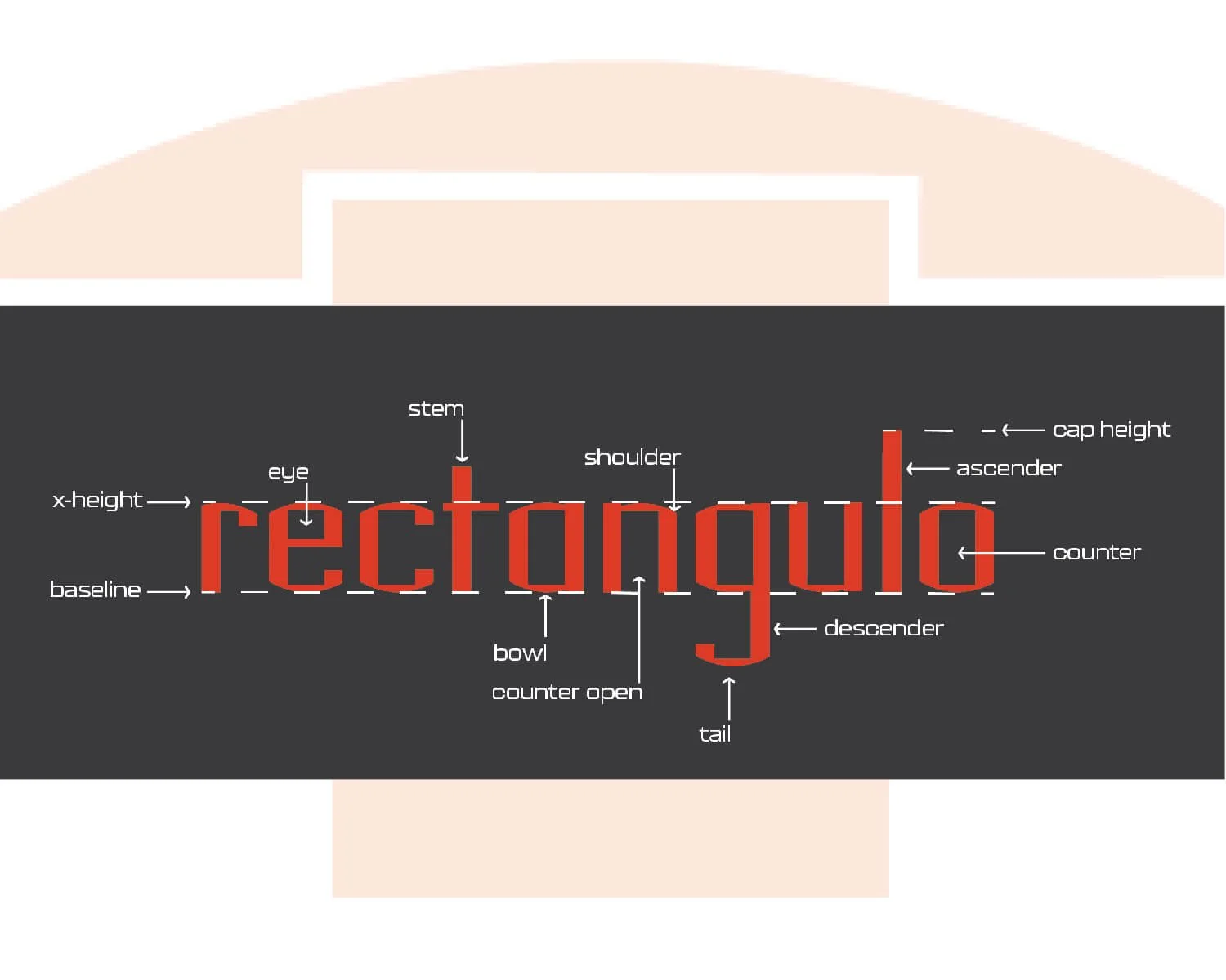
rectangulo
Typography
DESIGNX434-028 | Portfolio | UC Berkeley Extension
Background
We were tasked to experiment with various materials around our house to get inspiration for the creation of a new typeface in Shelley Greundler’s Typography DESIGN 450.9-029 class. One of the materials I chose was my son’s Legos. The key pieces that ended up being the building blocks for many of the letters had a half rectangle carved out of the bottom of the Lego and a curved top. We were tasked to initially create the letters a, s, h, i. The Lego pieces created an interesting type form with the very rectangular counter and curved exterior edges.
Design Problem
The biggest challenge was that that piece wouldn’t work for all letters. Many letters have no curve. The original design had a notch that I ended up having to remove to make the rest of the letters flow better. The diagonal strokes also were a little tricky.
Design Process
Initially I picked out Lego pieces that had some curve to them to create the h, & s. The first a I made was rectangular, basically a square with a tail. The i was easy, just a 4 wide Lego with a 1 wide for the dot. The curved piece I found for the h & s had an interesting character, so I rolled with that design as the inspiration for the rest of my typeface design. The next step was to create these forms within Illustrator.


Design Evolution
Each week I created a few more letters from the parameters of the initial set we designed. I got feedback in class and iterated on them until the font was uniform and ready to finalize. Once finalized, I uploaded each letter into Fontself to create a fully functional font that I can use within any software.
The final design is a geometric Sans typeface I named rectangulo. The name is derived from the fact that the “o’s” are created using rectangular counters and eyes.
The top and bottom of curved letters (a, b, c, d, e, g, h, j, m, n, o, p, q, r, s, u, w, y) have a curved exterior. Bowls are straight on the side and curved on the top. Crossbars (e, f, t, z) and the s spine are horizontal lines. Ascenders (b, d, f, h, k, l, t). & descenders are straight lines (g, j, p, q, y). Diagonal strokes and legs ended up either being a straight line or a line that his the vertical and returns to a thick straight line (k, v, x). The hooks are a narrower version of the curved bowls. I created two glyphs for the a, f, q, and v.
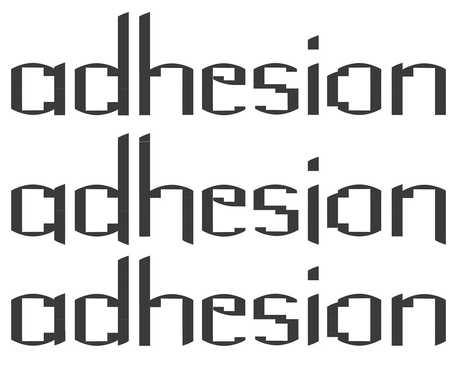
Second iteration - a, d, h, e, s, i, o, n (black on white)
Second iteration - a, d, h, e, s, i, o, n (white on black)
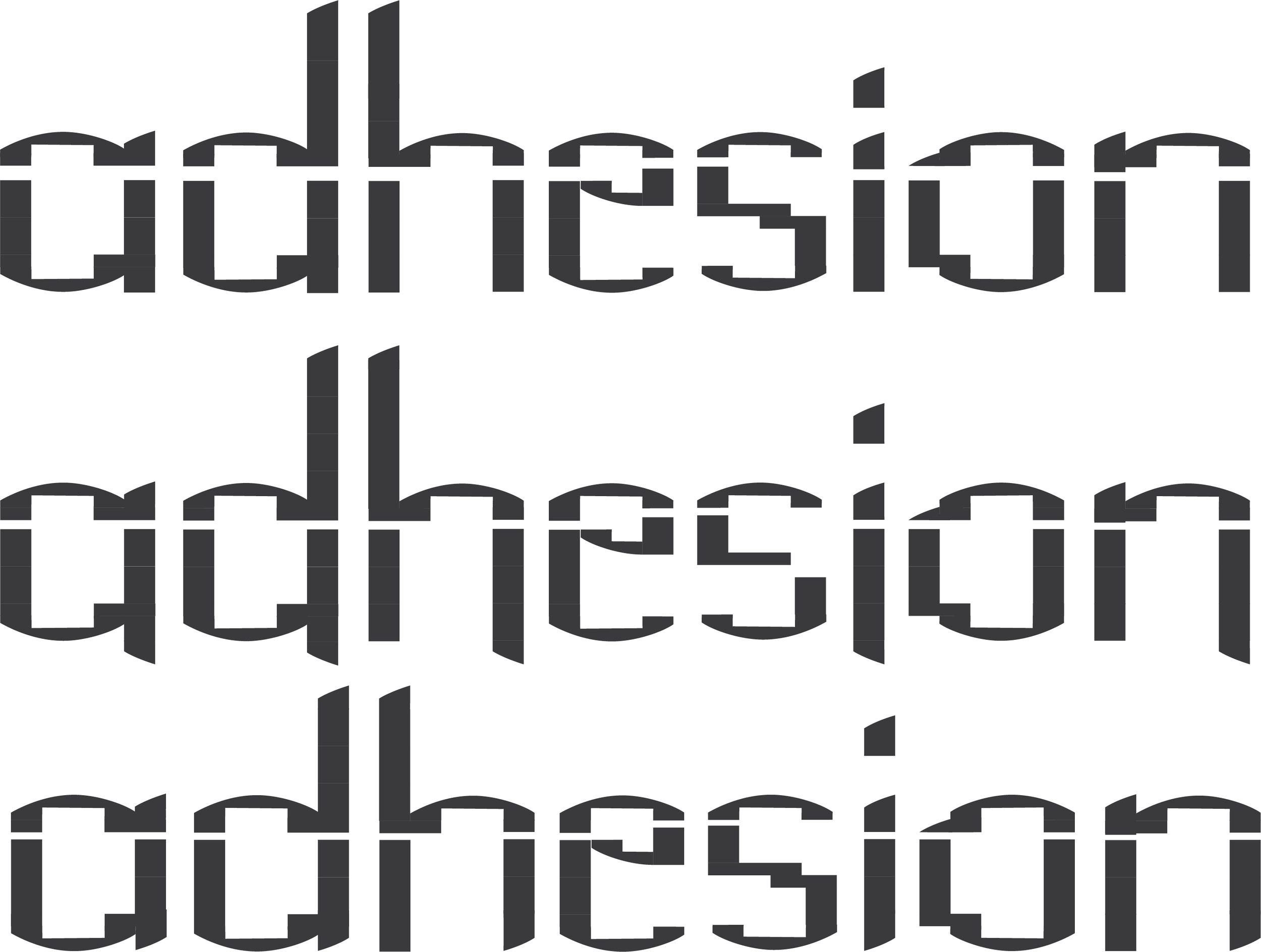
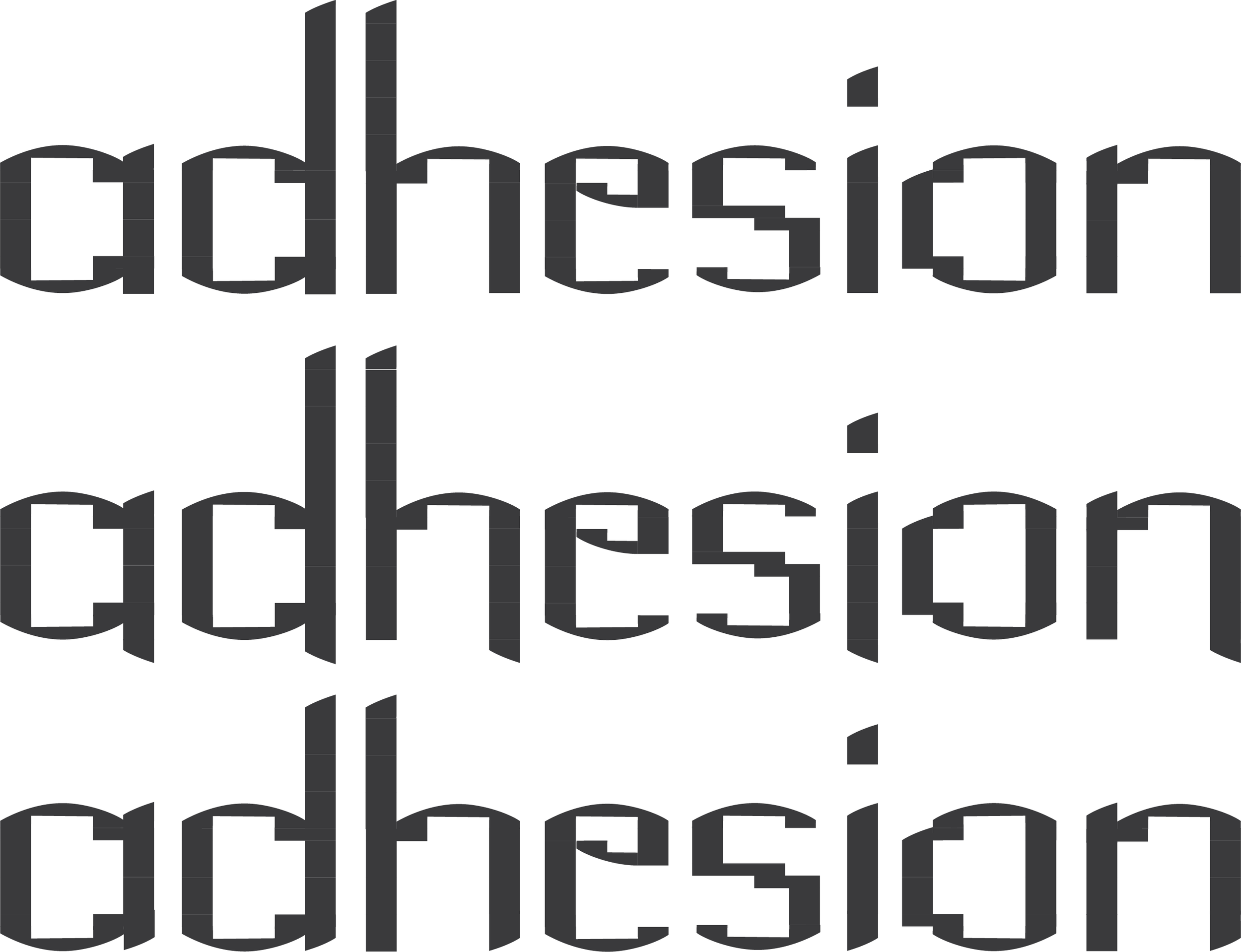
Second iteration - a, d, h, e, s, i, o, n (split letters, black on white)

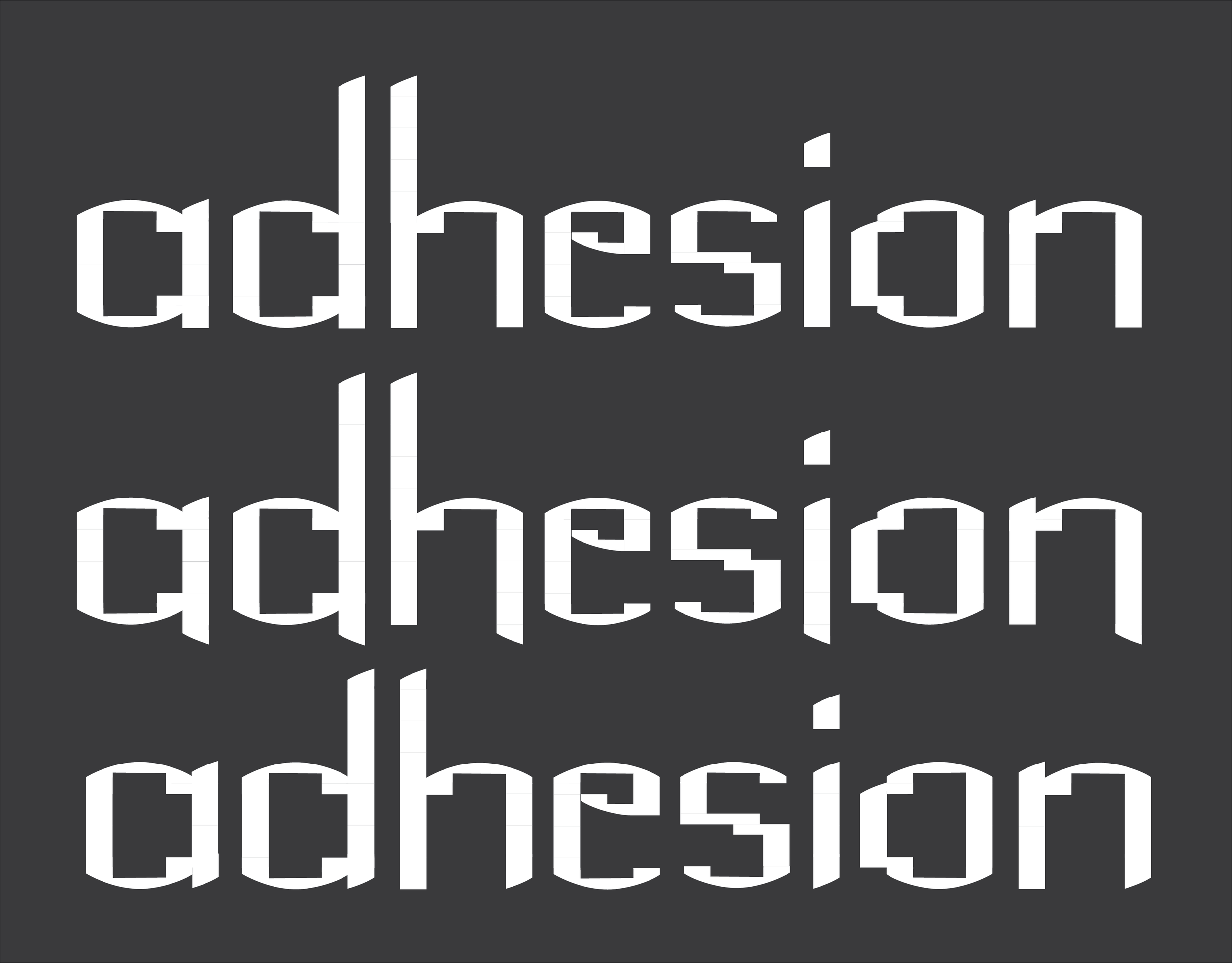
Second iteration - a, d, h, e, s, i, o, n (split letters, white on black)
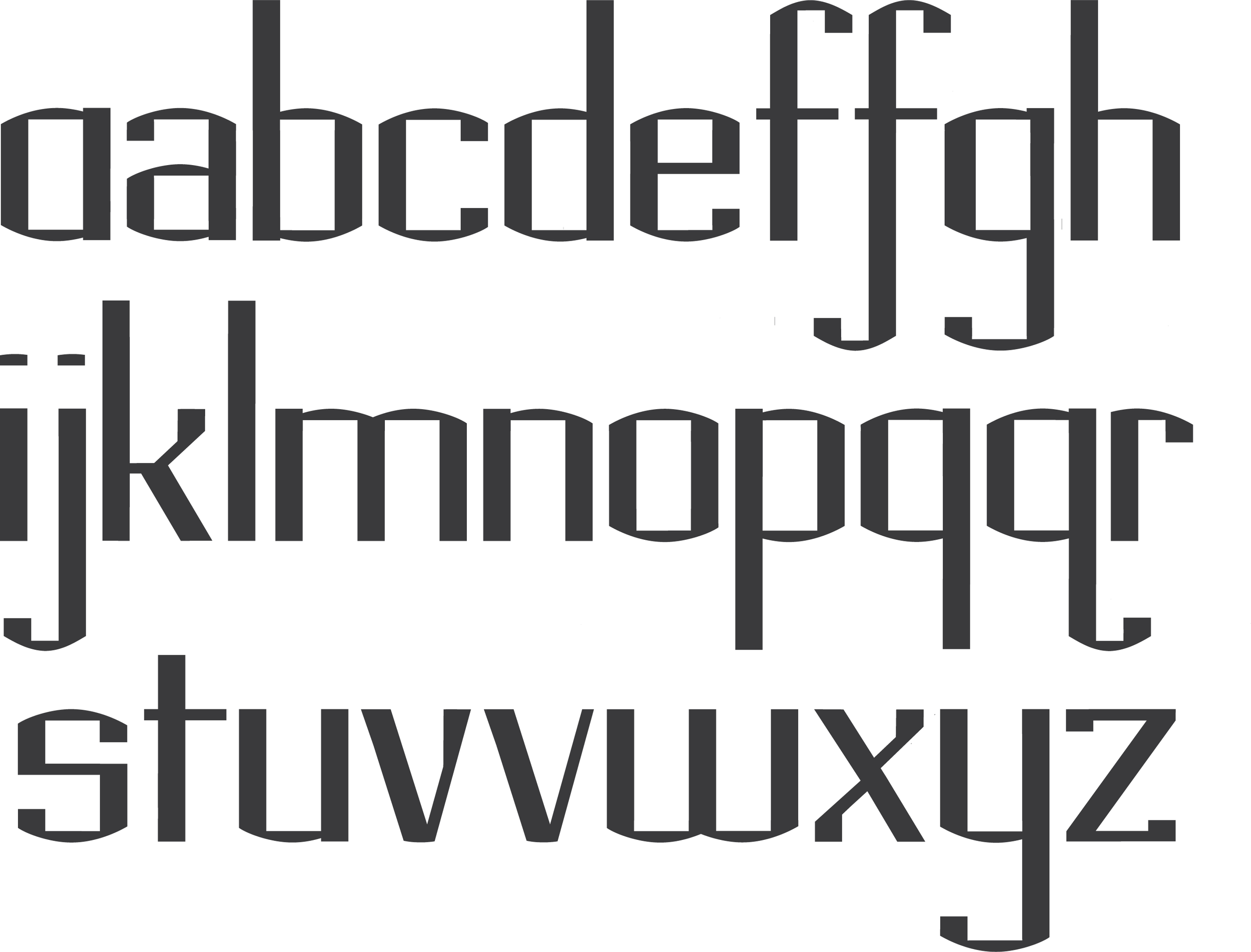
rectangulo alphabet with glyphs for a, f, q, & v (black on white)
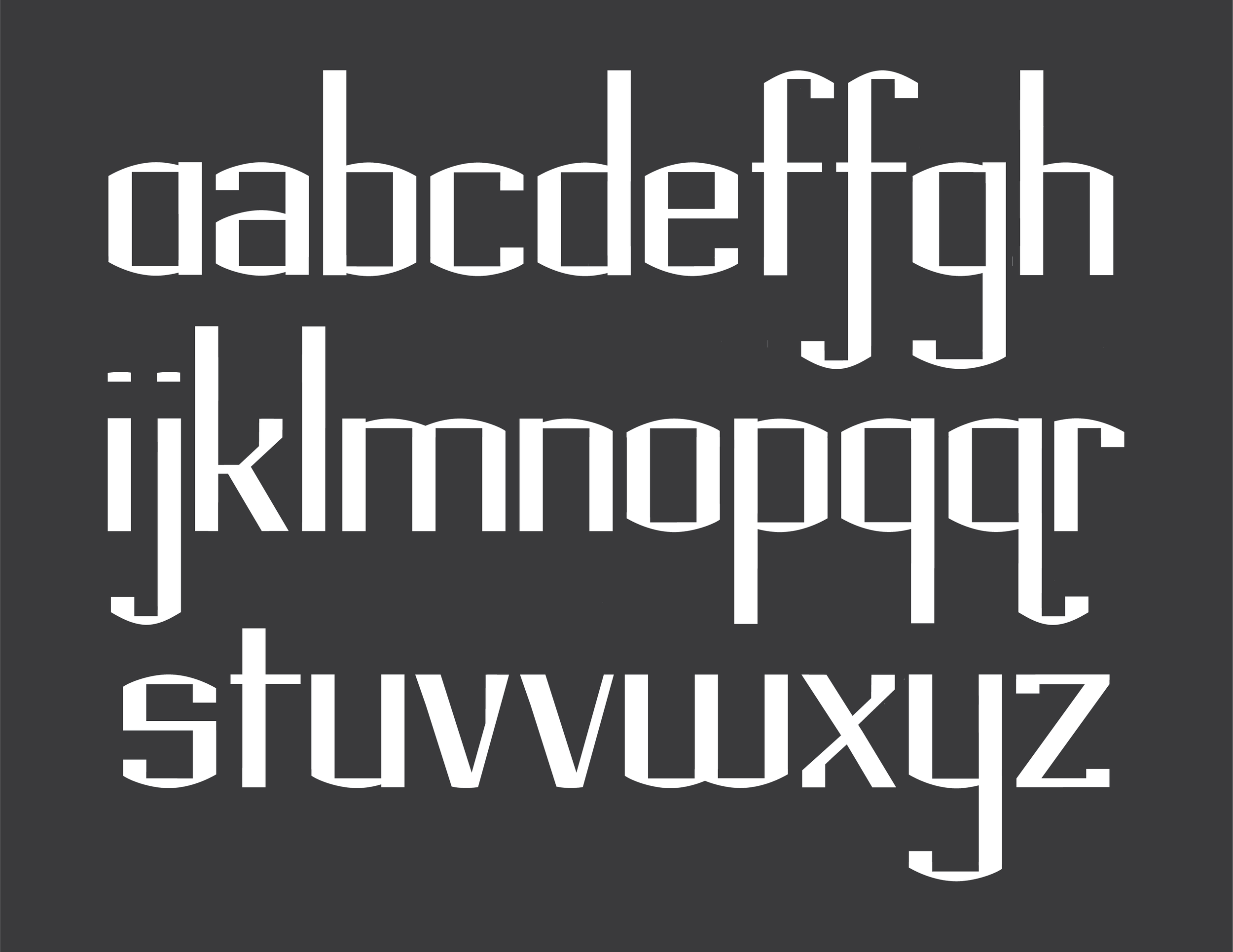
rectangulo alphabet with glyphs for a, f, q, & v (white on black)
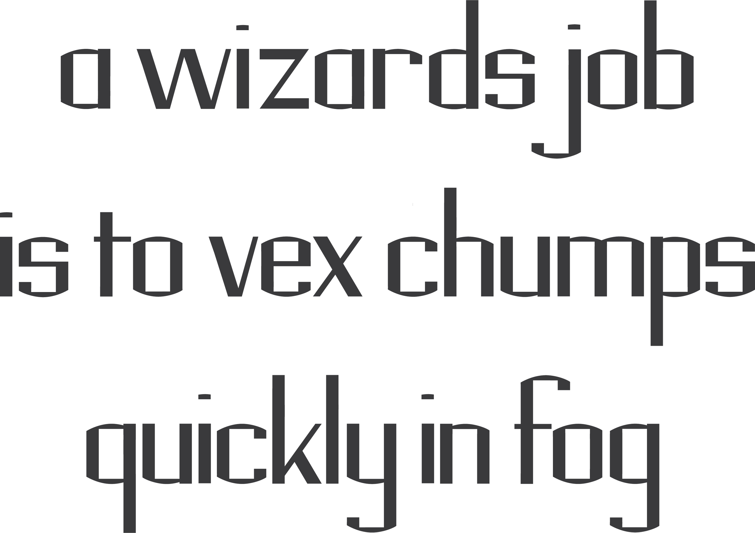
Pangram using rectangulo (black on white)

Pangram using rectangulo (white on black)

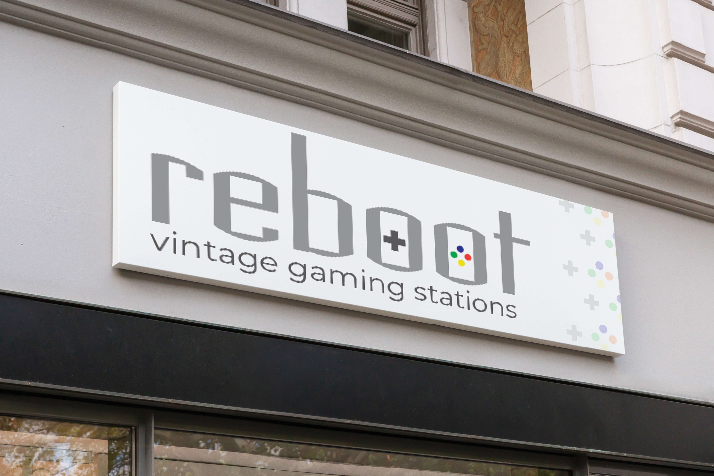
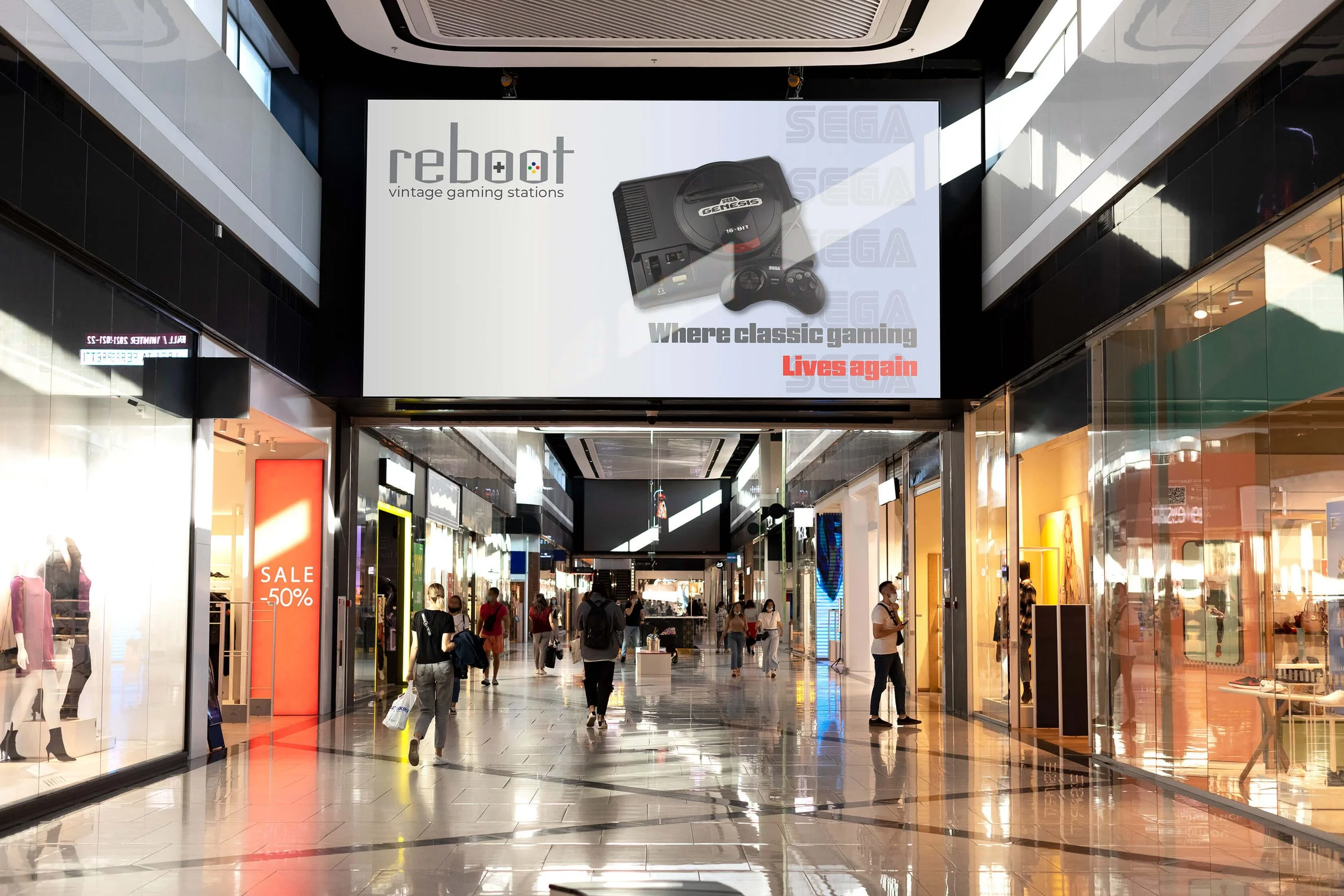
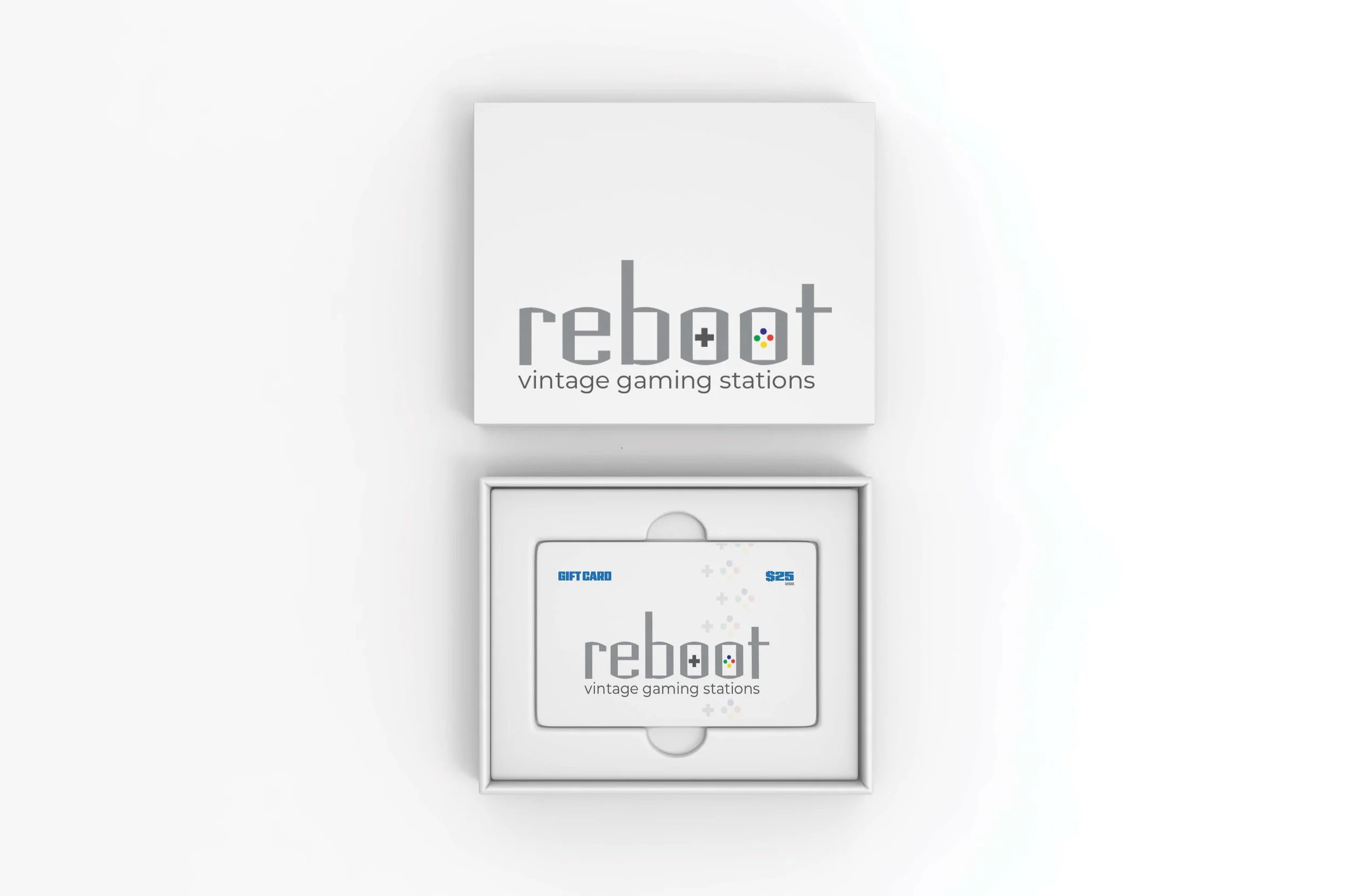
rectangulo - reboot vintage gaming stations (gaming store)
rectangulo - landmark BUILDERS (construction company)
rectangulo - volver (travel magazine)
Design Solution
The structured nature lends itself easily to the tech, science, and gaming industries. The unexpected exterior curve softens the visual experience allowing it to be used in the travel and high fashion industries.
-
![rectangulo - landmark BUILDERS - hard hat mockup]()
landmark BUILDERS - hard hat mockup
-
![rectangulo - volver - winter & spring issues]()
volver - winter & spring issues
-
![rectangulo - volver - summer & fall issues]()
volver - summer & fall issues
-
![rectangulo - reboot - store sign]()
reboot - store sign
-
![rectangulo - reboot - Atari store advertisement]()
reboot - Atari store advertisement
-
![rectangulo - reboot - Nintendo mall advertisement]()
reboot - Nintendo mall advertisement
-
![rectangulo - reboot - Sega mall advertisement]()
reboot - Sega mall advertisement
-
![rectangulo - reboot - gift card mockup]()
reboot - gift card mockup
-
![rectangulo - reboot - shopping bag]()
reboot - shopping bag